
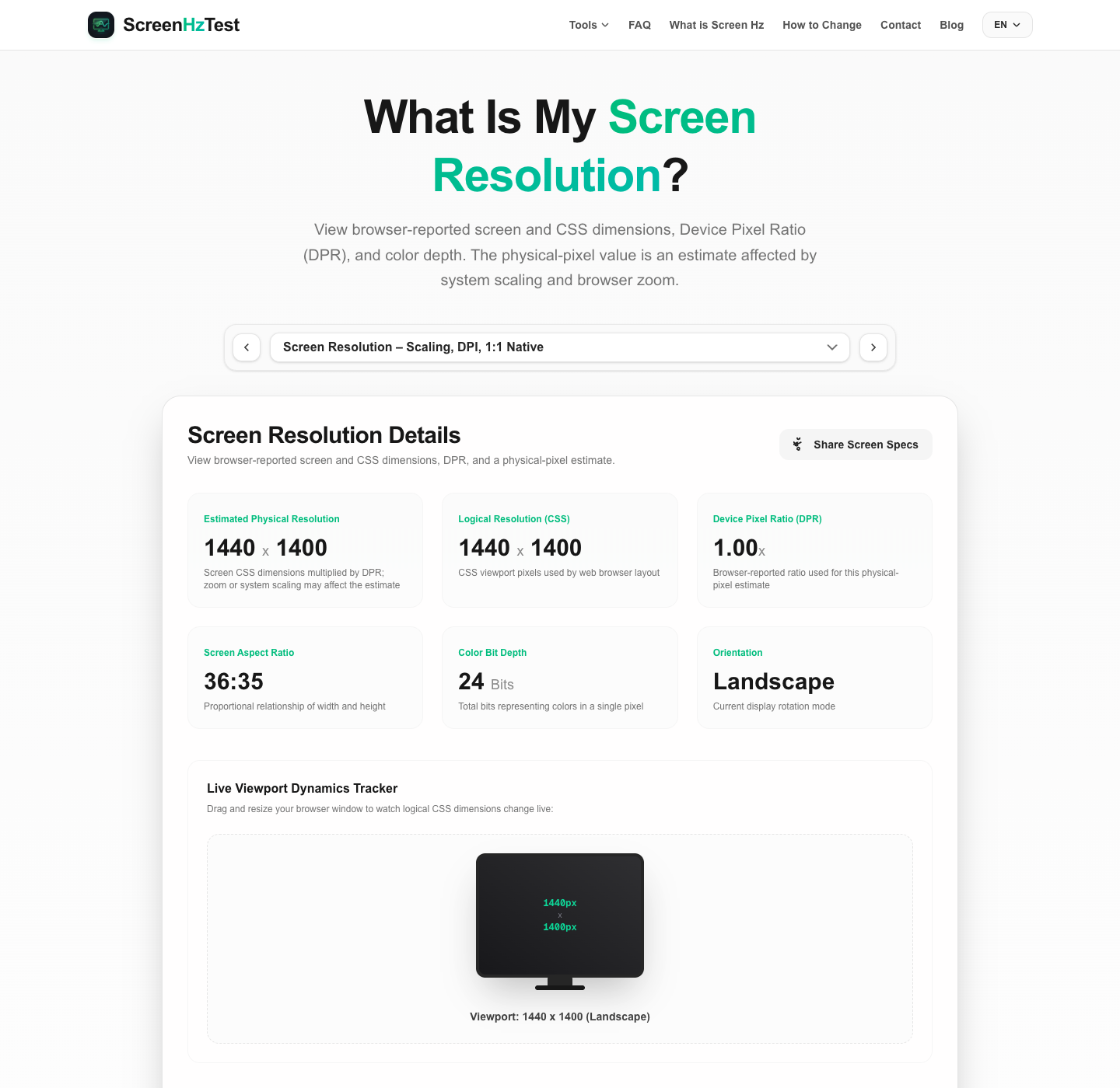
If you are asking yourself, "what is my screen resolution?", this page shows the dimensions reported to your browser. The screen resolution test reads browser properties for screen size, device pixel ratio (DPR), and viewport layout; it estimates physical-pixel dimensions by multiplying the reported screen dimensions by DPR. It runs in the browser without installing software and can help hardware enthusiasts, software developers, UI/UX designers, and other users compare those values. System scaling, browser zoom, and device configuration can affect the estimate, so it does not independently confirm the display panel's native specifications.
What Is My Screen Resolution and How Does This Test Work?
A screen resolution test shows dimensions reported by the browser, helping answer the question: what is my screen resolution? The term "resolution" often refers to the grid of pixels used to form images. This value is expressed as width times height—for example, a 1080p display mode is 1920 by 1080 pixels. Browser-reported dimensions do not always equal the panel's physical pixel count.
Our browser-based screen resolution test reads JavaScript properties such as window.screen.width, window.screen.height, and window.devicePixelRatio. The page shows those browser-reported values and estimates physical-pixel dimensions from screen size and DPR; it cannot query a panel hardware sensor or guarantee the estimate matches the panel's native resolution.
Additionally, this tool includes a live viewport tracker. Unlike the static screen size, the viewport represents the active rendering window inside your web browser. By registering a listener on the window's resize event, our tool tracks layout adjustments in real-time, helping web developers test responsive layouts and breakpoints under different scaling conditions.
Physical Resolution vs. Logical CSS Resolution Explained
One of the most common points of confusion for screen users is the difference between physical resolution and logical CSS resolution. While they were identical on older monitors, modern displays use scaling technologies that keep these two numbers separate:
- Physical Resolution represents the actual physical pixels embedded in the display panel. For example, a 4K UHD monitor has exactly 3840 physical horizontal pixels and 2160 physical vertical pixels.
- Logical CSS Resolution (also called layout viewport size) is the resolution used by web browsers to render text, images, and layout elements. If a 4K screen was rendered at its physical resolution, web pages, buttons, and fonts would appear microscopic and unreadable. To prevent this, operating systems scale the interface (e.g., at 200%), rendering a logical resolution of 1920x1080 while using the physical 3840x2160 pixels to keep edges incredibly sharp.
This page shows browser-reported dimensions and a physical-pixel estimate side by side. Developers can compare them while checking a layout, but the values alone do not guarantee that a page or display is correctly calibrated.
Understanding Device Pixel Ratio (DPR) and HiDPI Screens
Device Pixel Ratio (DPR) is a browser-reported scale factor that commonly relates CSS pixels to device pixels. The displayed physical-pixel estimate uses the browser's screen dimensions and DPR; it may differ from the panel's native resolution when scaling or zoom is involved:
On standard legacy displays, the DPR is exactly 1.0, meaning one physical pixel represents one logical pixel. However, on high-density displays (such as Apple's Retina displays, Microsoft Surface screens, and modern smartphones), the DPR is typically 2.0, 3.0, or even 4.0.
For an illustrative example, if a browser reports 393 × 852 CSS pixels and a DPR of 3, multiplying gives an estimated 1179 × 2556 device pixels. This arithmetic example does not identify a particular phone model or confirm its panel resolution.
How to Change Your Display Resolution to Match Your Screen Resolution
If our screen resolution test reveals that your system resolution is set lower than your monitor's native capabilities (such as running a 4K screen at 1080p), you can easily adjust this in your operating system settings. Follow our step-by-step instructions below:
Changing Screen Resolution in Windows 10 & 11
- Right-click on an empty space on your desktop and select Display settings.
- If you have multiple monitors, click on the display you want to change at the top of the menu.
- Scroll down to the Scale & layout section.
- Click the dropdown menu next to Display resolution.
- Select your monitor's native resolution (usually marked as "Recommended", e.g., 1920x1080 or 3840x2160).
- A prompt will ask "Keep these changes?". Click Keep changes to confirm.
- To adjust size scaling, open the Scale dropdown and choose a percentage (e.g., 150% or 200%) to keep text readable.
Changing Display Resolution on macOS
- Click the Apple menu in the top-left corner of the screen and choose System Settings.
- Click Displays in the left sidebar.
- Select your display at the top of the menu.
- Under the resolution options, choose a scaled resolution to adjust text size, or select Default to use the system recommended layout scaling.
- To see all physical resolution options, right-click any of the scaled options and toggle on Show List.
Common Screen Resolution Standards and Aspect Ratios
In modern consumer electronics, displays are grouped into standard resolutions and aspect ratios. The table below outlines these common industry configurations:
| Standard Name | Pixel Dimensions | Aspect Ratio | Primary Uses |
|---|---|---|---|
| HD / 720p | 1280 x 720 | 16:9 | Budget TVs, older tablets, budget laptops |
| Full HD / 1080p | 1920 x 1080 | 16:9 | Standard monitors, gaming, streaming media |
| WUXGA | 1920 x 1200 | 16:10 | Office productivity laptops, design screens |
| QHD / 1440p / 2K | 2560 x 1440 | 16:9 | Mid-to-high-end PC gaming, office screens |
| UHD / 4K | 3840 x 2160 | 16:9 | Premium TVs, design monitors, console gaming |
| UHD / 8K | 7680 x 4320 | 16:9 | Next-gen screens, professional editing stations |
Inspecting Fine Patterns and Browser Scaling
Fine lines or color edges can look different depending on browser zoom, system scaling, device pixel ratio, display processing, and the rendered pattern. A visual difference alone does not establish that scaling is the cause.
The browser renders CSS pixels onto a device-pixel grid. Scaling and zoom can change how a pattern maps to that grid, but this page cannot determine which stage caused a particular visual effect or inspect the monitor's native pixel mapping.
To compare this browser-rendered pattern under different conditions, try these steps. They do not certify a 1:1 physical panel mapping:
- Reset Browser Zoom: Press
Ctrl + 0(on Windows/Linux) orCmd + 0(on macOS) to return browser zoom to 100% and compare the pattern again. This does not disable system scaling. - Examine the Pattern: Observe how fine lines appear at your usual browser and system settings. Ripples, bands, or color changes are visual observations, not a diagnosis of interpolation or a panel defect.
- Review OS Scaling Settings: Check the scaling option for your display if you are comparing browser layouts. A 100% setting does not guarantee one CSS pixel maps to one physical panel pixel on every device.
- Check Display Settings Separately: Consult the monitor and GPU documentation for supported resolution modes. This browser pattern cannot diagnose a cable, connection, GPU scaling, or overscan issue.